Design a new B2B SaaS app to help businesses manage their order shipments:
ParcelHero Pro
Helping e-commerce businesses manage shipments in bulk, optimise their costs & automate their process.
Overview
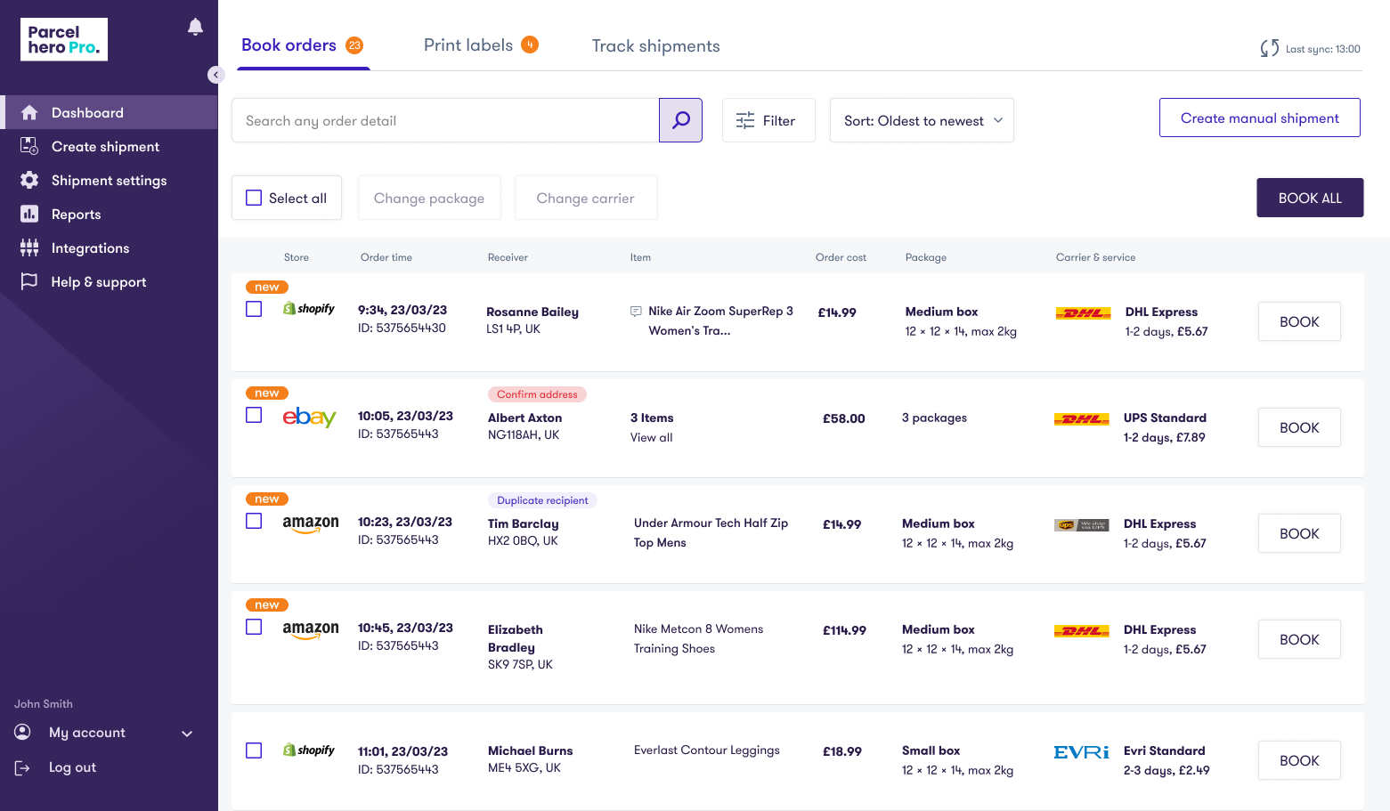
ParcelHero Pro is a web app that consolidates businesses e-commerce orders, allowing them to manage their shipments in one place for efficient order and shipping management. Orders can be imported from Shopify, Amazon and eBay.
I led the UX and UI direction from conception and collaborated with product managers and stakeholders throughout. And then with the engineering lead during the development process.
Problem
Small to medium businesses find it very time-consuming managing their order shipments on multiple point of sale platforms. They are also restricted to one or two shipment carriers.
Aim
- Develop an app that consolidates orders from different platforms, allowing users to manage their shipments in one place.
- Streamline their workflow by offering automation rules and default settings – helping them to save time.
- Offer users a variety of cost effective shipping services.
- Allow users to track shipments in real-time and take action on them when necessary.
My role
- End to end product design
- UX research & design
- UI Design
- Create & maintain design system
- Help shape the product roadmap
- Produce research & UX documentation
- Cross-team collaboration
Listening to users & designing from scratch
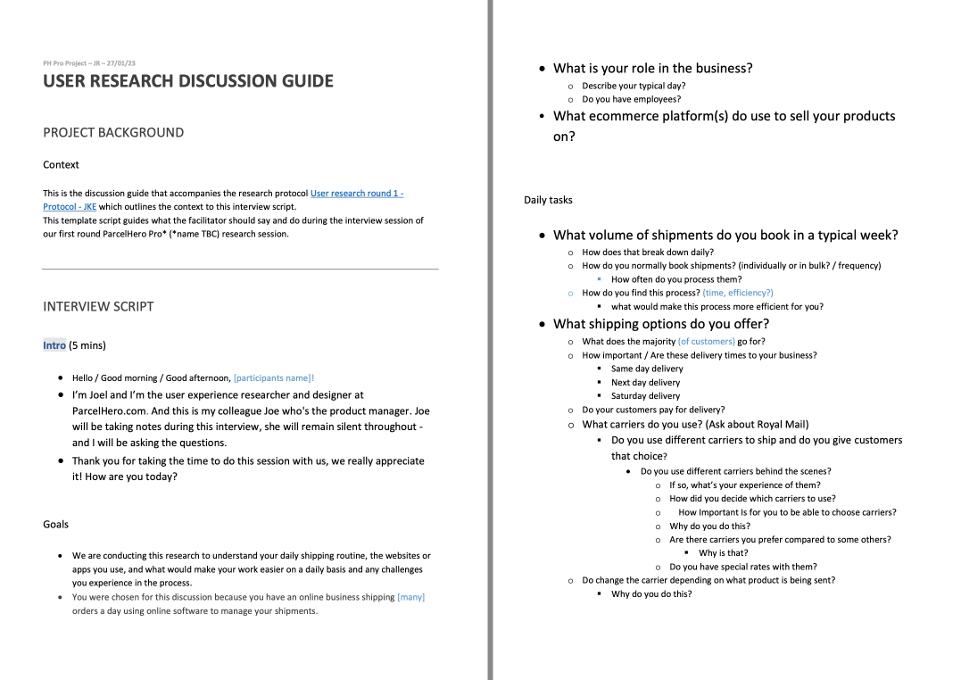
As we had the luxury of designing the app from scratch, I used the Design Thinking process as a guide and in collaboration with the Product Manager, began by interviewing business owners & employees who are involved with shipping orders. The aim was to discover their behaviours, needs and tools they are using now. The results would help inform the product roadmap, prioritise features and guide design decisions.
I wrote a discussion script and UserTesting.com was used to source participants. I then interviewed six subjects individually over a 60 min video call.
“I copy and paste info from one site to another”
“Parcel getting lost and the tracking status is stuck on the same status. You need to contact them & it takes a long time”
“The carrier didn’t turn up to collect my parcels”
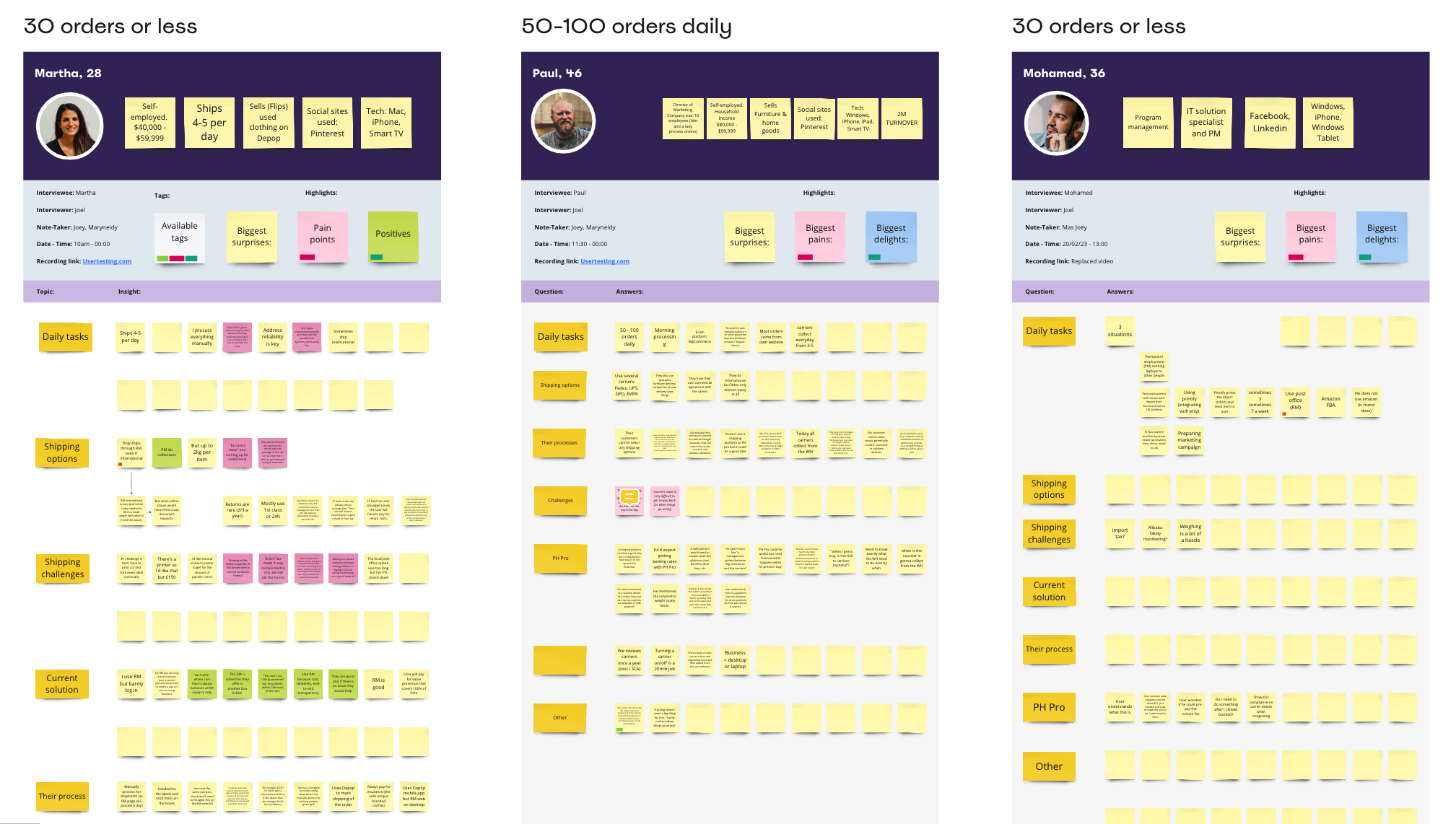
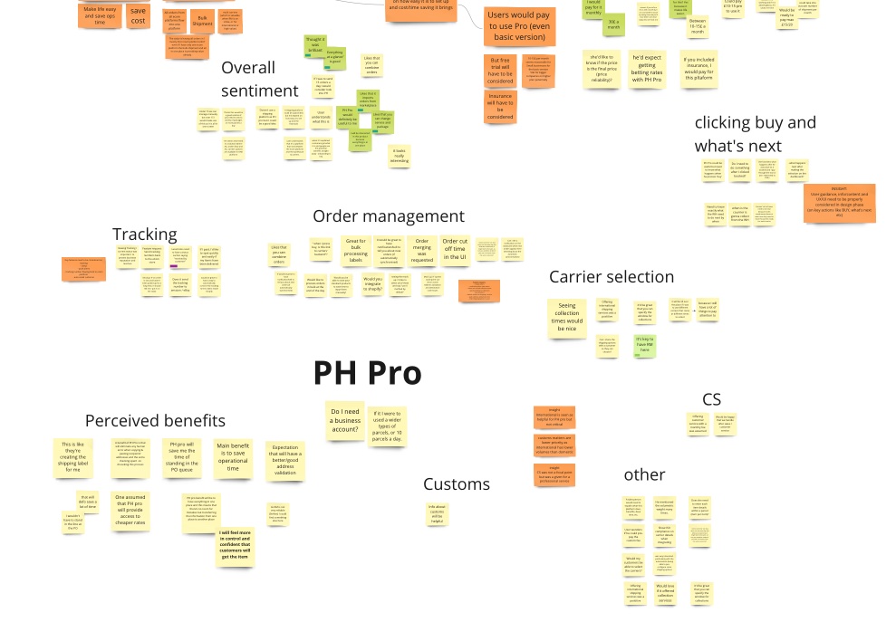
Synthesising research findings
With the qualitative data captured, we organised them into themes using Miro, the participant information also helped us form personas.
An Affinity Map also helped us identify common behaviours and pain points.
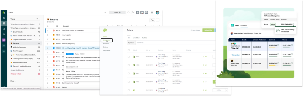
Checking out the competition
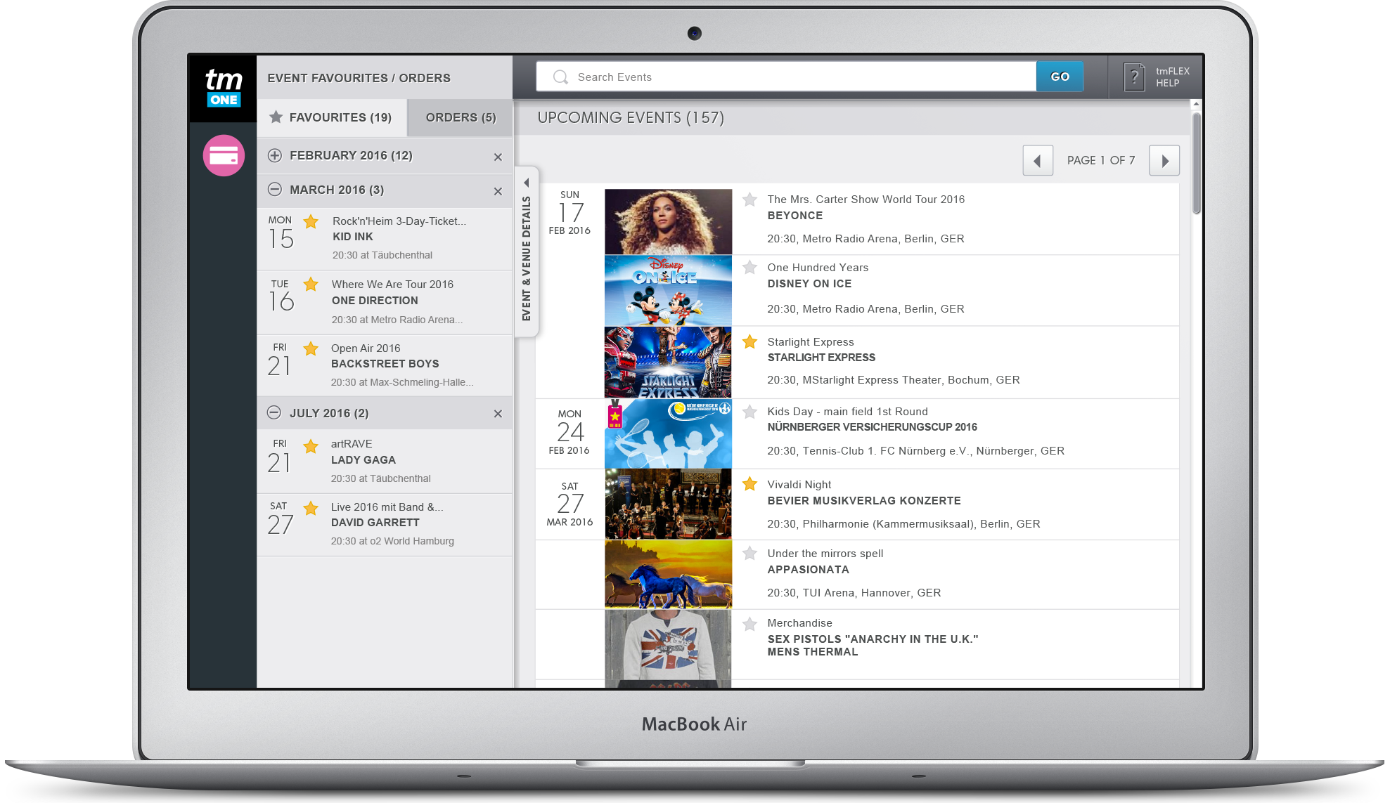
Looking at competitors gave me a benchmark of where they were in their user experience design and how we could improve on it.
I found that the competition was a mix of mature and start up products. The start up products looked very good, setting a high bar for design and UX, however I also identified plenty of areas that we could improve on.

Making the app feel familiar
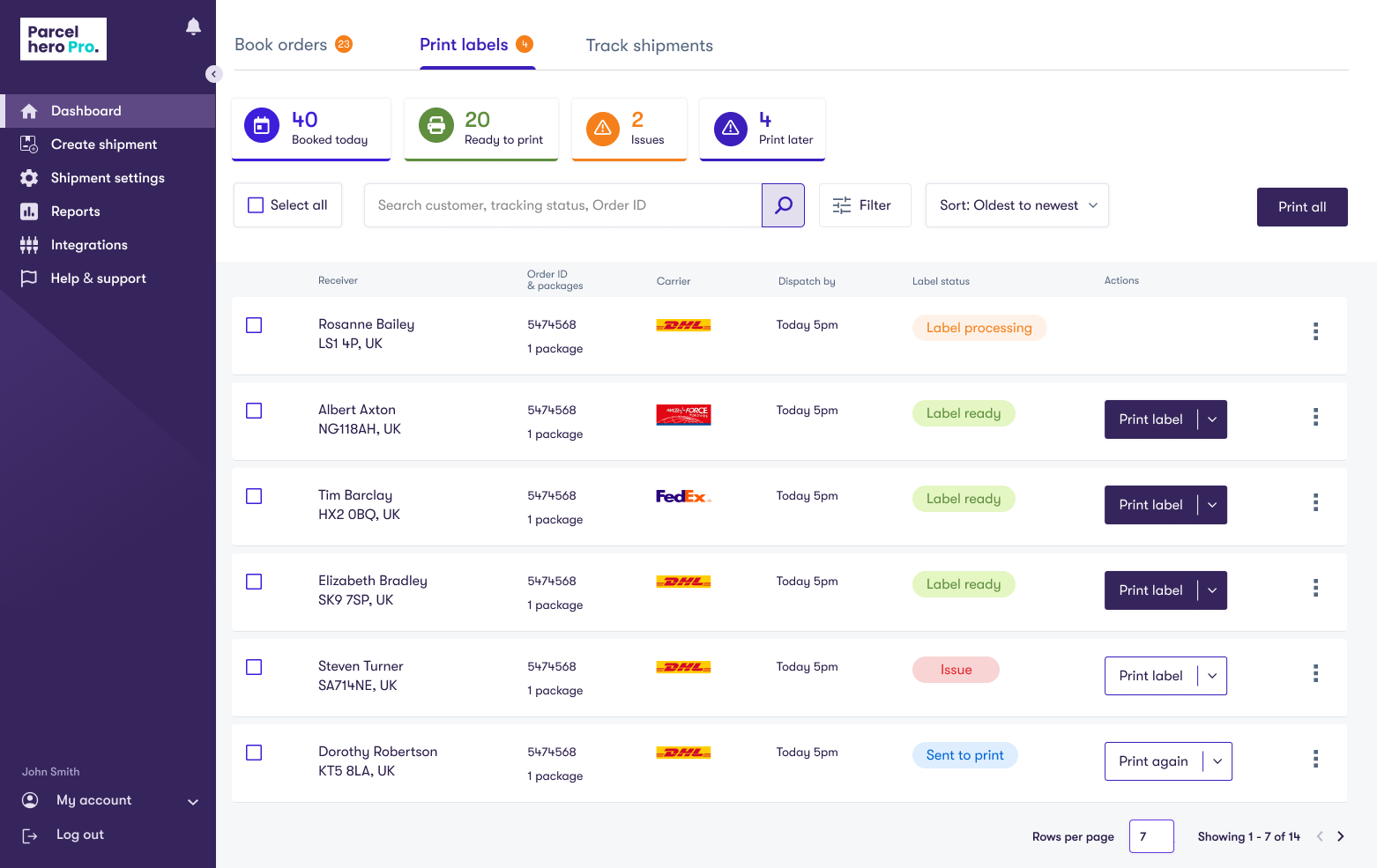
We wanted users to be able to onboard & get shipping quickly and easily, without having to learn where everything is. To achieve this I used common web app patterns for our layout that users would be familiar with.
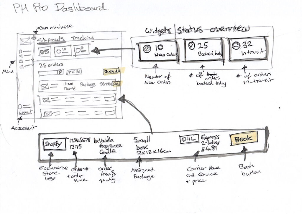

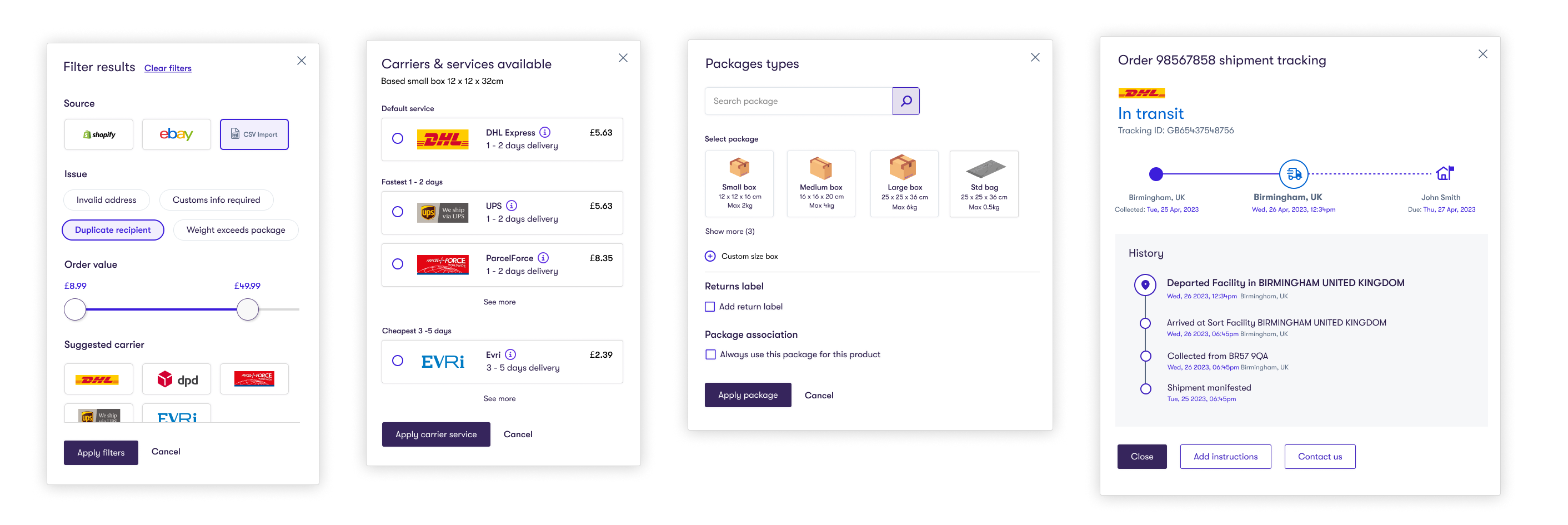
Life-like prototyping
I used Figma to create a high-fidelity prototype for both user testing and internal reference. The prototype is mostly interactive in order to give test participants an experience as close to the real thing as possible.
Insights from user testing
I conducted remote user testing using the prototype to validate the design decisions and ensure we were still keeping the user at the centre of our process.
Some of the feedback were as follows:
Notices duplicate recipient and address error. States that it’s not clear what this is and suggest to put an ‘i’
Doesn’t fully understand what ‘Integration’ will do
Likes the bulk actions. They are similar to what they see in their supplier portal
“It really simplifies the shipping process”
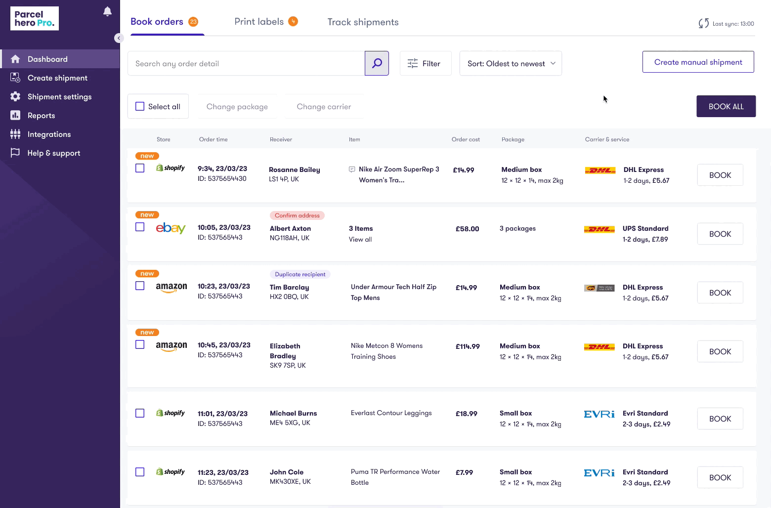
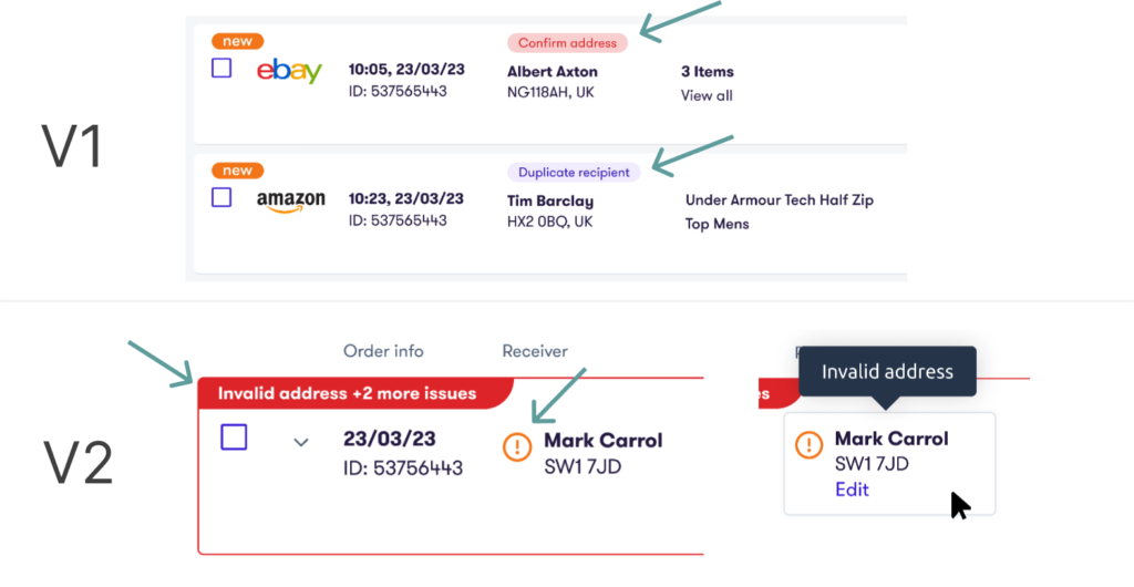
Discovering issues in the UI
Our interface had to highlight values that were invalid or missing.
In my first iteration I used a label above the attribute to indicate this. However, it later became apparent that there could be more than one issue per attribute and the UI didn’t have space in the column for multiple.
I solved this by utilising a message banner in the top left of the order row, describing one key issue and surfacing the number of other issues
Final experience
I designed all the UI based on a style guide created by an external agency.
The product was designed for use on desktop and tablet. With only the registration and onboarding being available on mobile. This was decided because most users would be using it from office desks.


The app can be themed to specific brands

More case studies

B2B2C Sports ticketing site
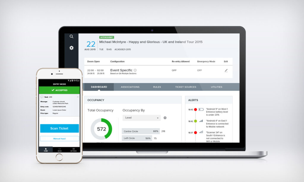
Access control management