Redesigning Venue Access Control
Untangling a complex, unintuitive web app to help venue managers better manage their event operations.
Overview
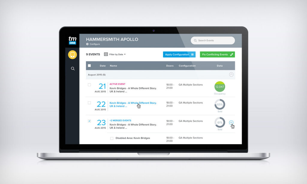
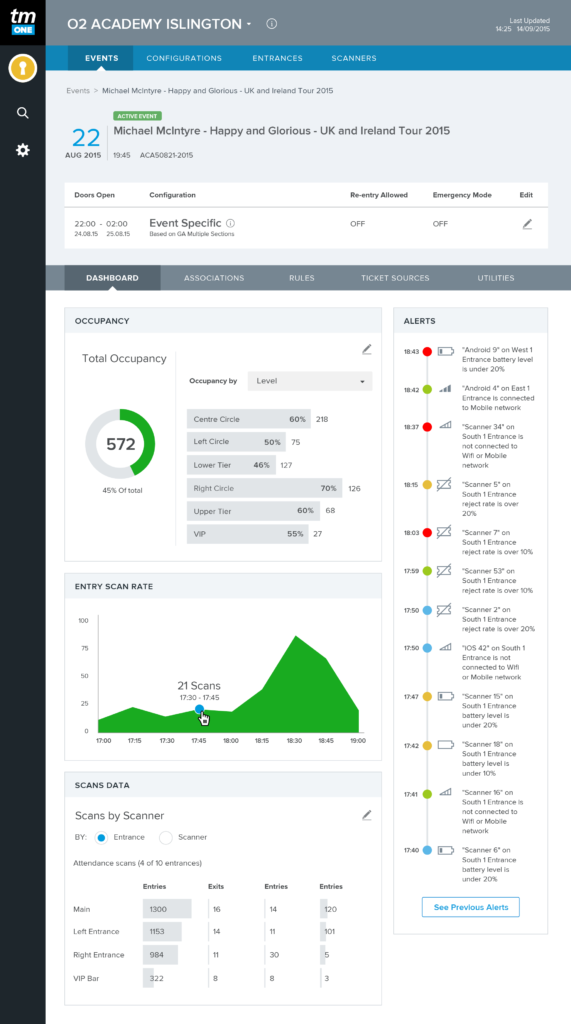
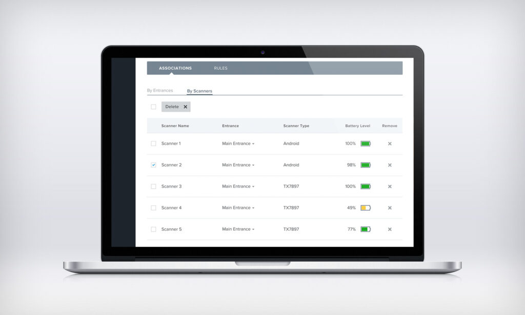
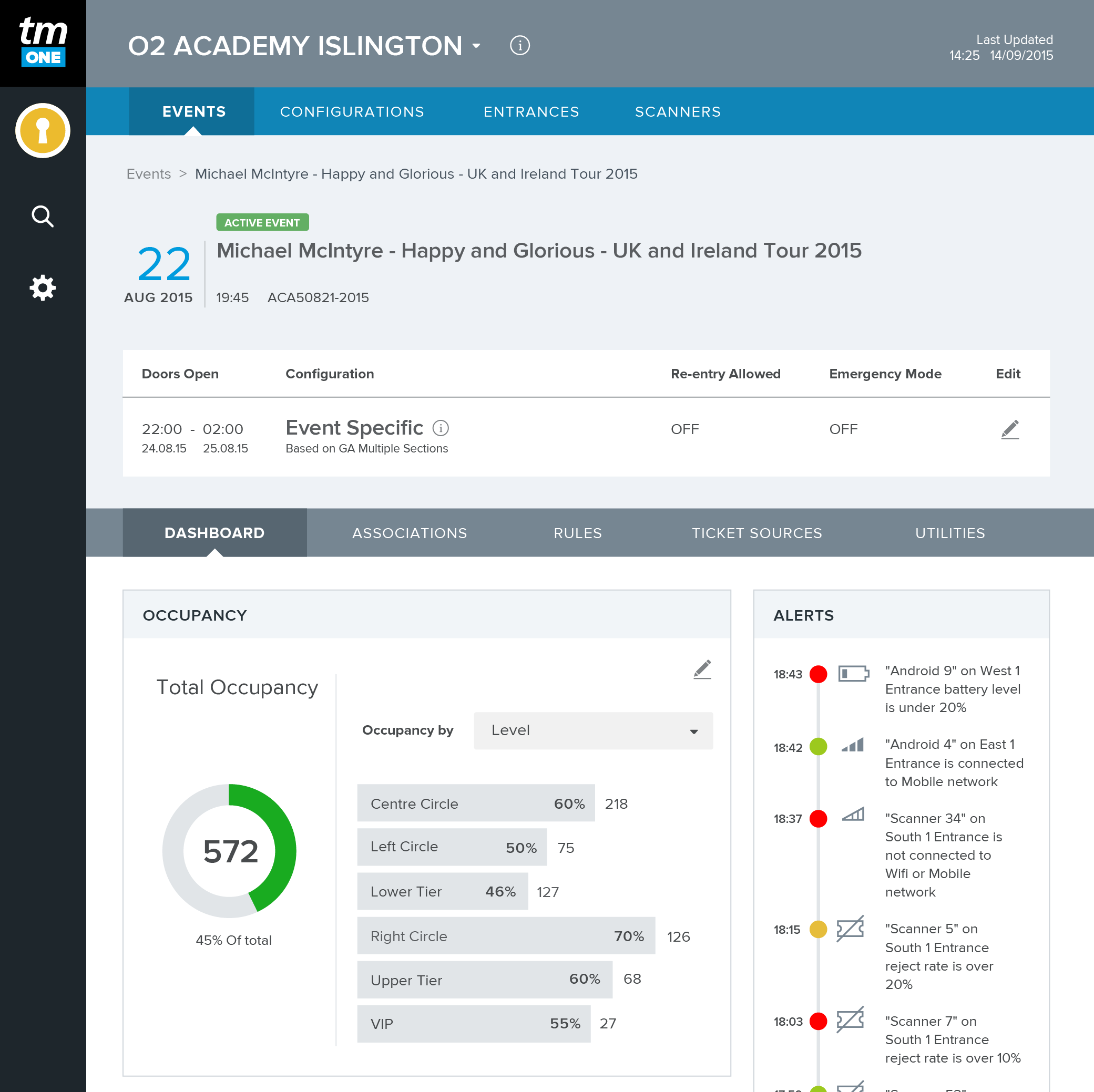
TM Access is a web based B2B venue management app for desktop and tablet. It enables venue clients to view real-time occupancy data and manage their access control setup and operations.
The accompanying mobile app, TM Scan, is a handheld ticket scanner app for smart phones and scan devices.
The problem
Ticketmaster’s current offering of venue access control is complicated and does not fully meet the client’s needs.
Aim
- Build a new, web based access control app that clients can also use on tablet devices.
- Make existing features easier to use and introduce a new dashboard overview.
- Offer a better app experience for venue client users and bring the app inline with Ticketmaster’s suite of other B2B apps.
My role
- Facilitate the product UX design, from concept through to development
- Liaise with stakeholders throughout the project
- Explore UX design ideas for the mobile and desktop app
- Conduct UX research
- Work with UI, engineering and product manager to produce feasible, great features
- Ensure the app design caters for localisation
The app before UX/UI design
The app was originally put together by the engineering and product team before the UX and UI redesign. Clients said the application was overly complicated and unintuitive to use.
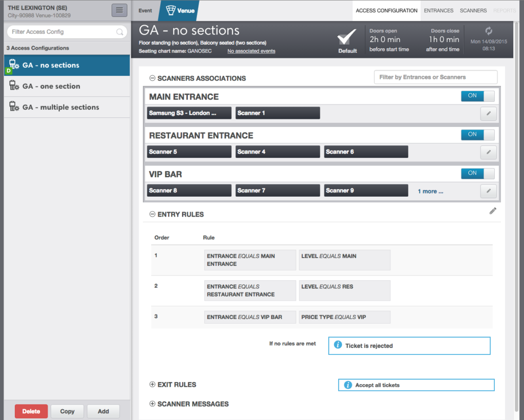
Understanding the current product
In order to fully understand the current application and its features I conducted a heuristic evaluation on its current state (the one pictured above). The findings allowed me to create a list of quick wins and a prioritised roadmap of usability solutions.
Lacks visual hierarchy
Inconsistent use of icons and call to actions
Unintuitive layout and unexpected behaviour
Ambiguous call-to-action labels
Checking out the competition
To understand the current market and discover opportunities for new features, I conducted a competitor analysis. I found that the competition was also outdated and well behind on offering a good experience.
Discovering our users
Using the data and information gathered from our clients I created a set of seven personas.
Each persona represented someone who would use the app in a different way, they were also from a variety of European countries as those would be our key markets.
Deconstructing the navigation
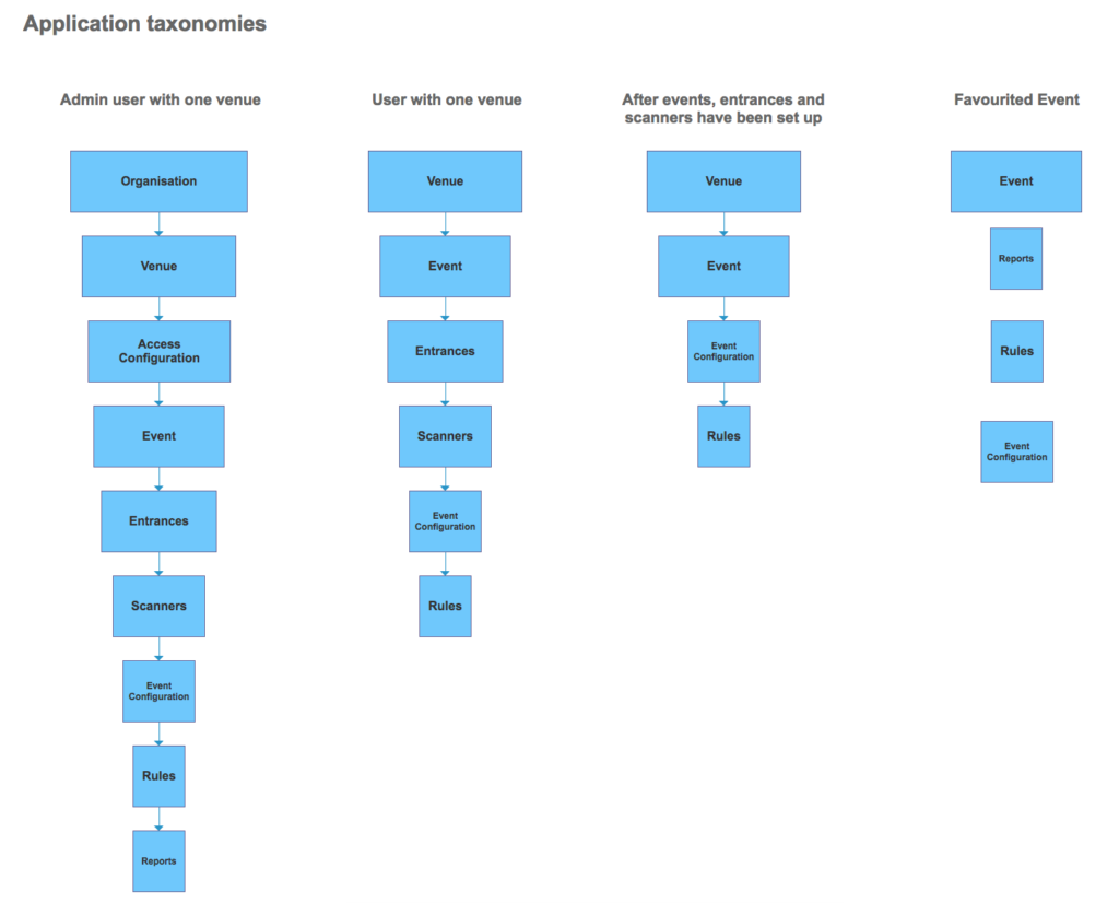
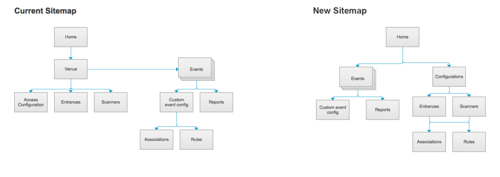
The current navigation menu lacked a proper hierarchy, so was confusing to look at no matter how many times you’ve used it. Clients found it difficult to use every time.

Untangling the complex
To untangle the navigation, I began by mapping out the current journeys & taxonomies, and then remodelling them into a logical order that was more intuitive.

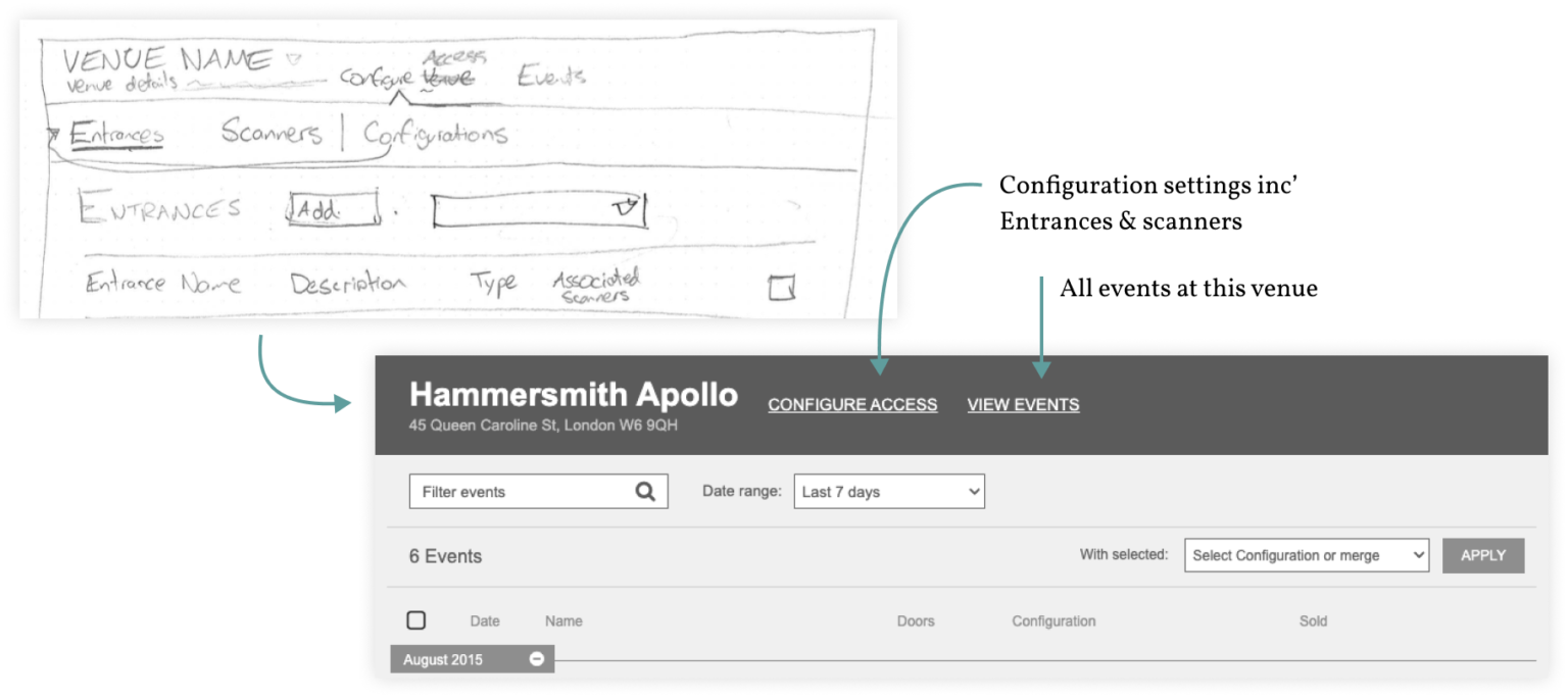
Initial navigation mock ups
In my first version of the navigation I wanted to keep the amount of navigation items to a minimum. So I hid the venue configuration items (Settings, Entrances & Scanners) under the “Configure Access” menu. However, after validating this with the clients, I found they did want quick access to those items.
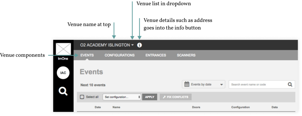
Final navigation layout
My final navigation layout showed a clear hierarchy of information. Featuring the venue name at the top (some clients had access to multiple venues) and key menu screens below. Users could easily flick between information screens and config’ settings.
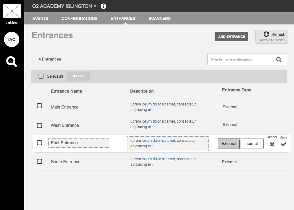
Detailed wireframes
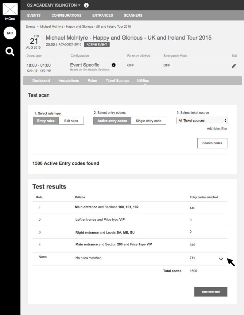
The app is highly complex, so detailed wireframes showing every state of the UI was required & documented. This helped engineering to understand how it works when it came to build.


Proof of concept
A working concept was created to see how the UI performed in real world conditions. The video below shows a ticket being scanned and data being updated on the UI.

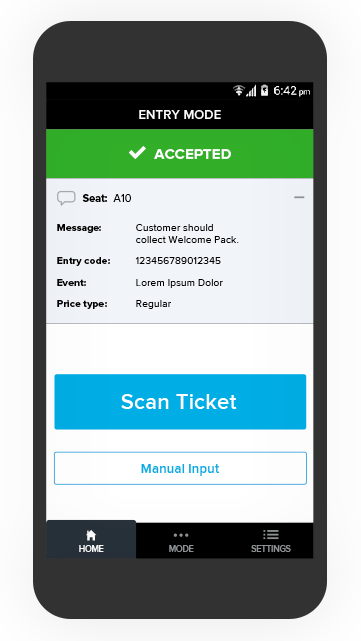
Handheld scanner app
The scanner app is a hybrid application which works on both Android and IOS devices to accompany the desktop app and work together. It was designed to be used on a dedicated, low resolution scanner device as well as smart phones. The ability for clients to use smart phones as a scanner device allowed them to be cost effective and flexible in their operations.

Final ui designs
