TICKET BOOKING WHITE LABEL FOR SPORTS CLIENTS
Redesigning a legacy B2B2C e-commerce platform to offer a better user experience and added value for clients.


OVERVIEW
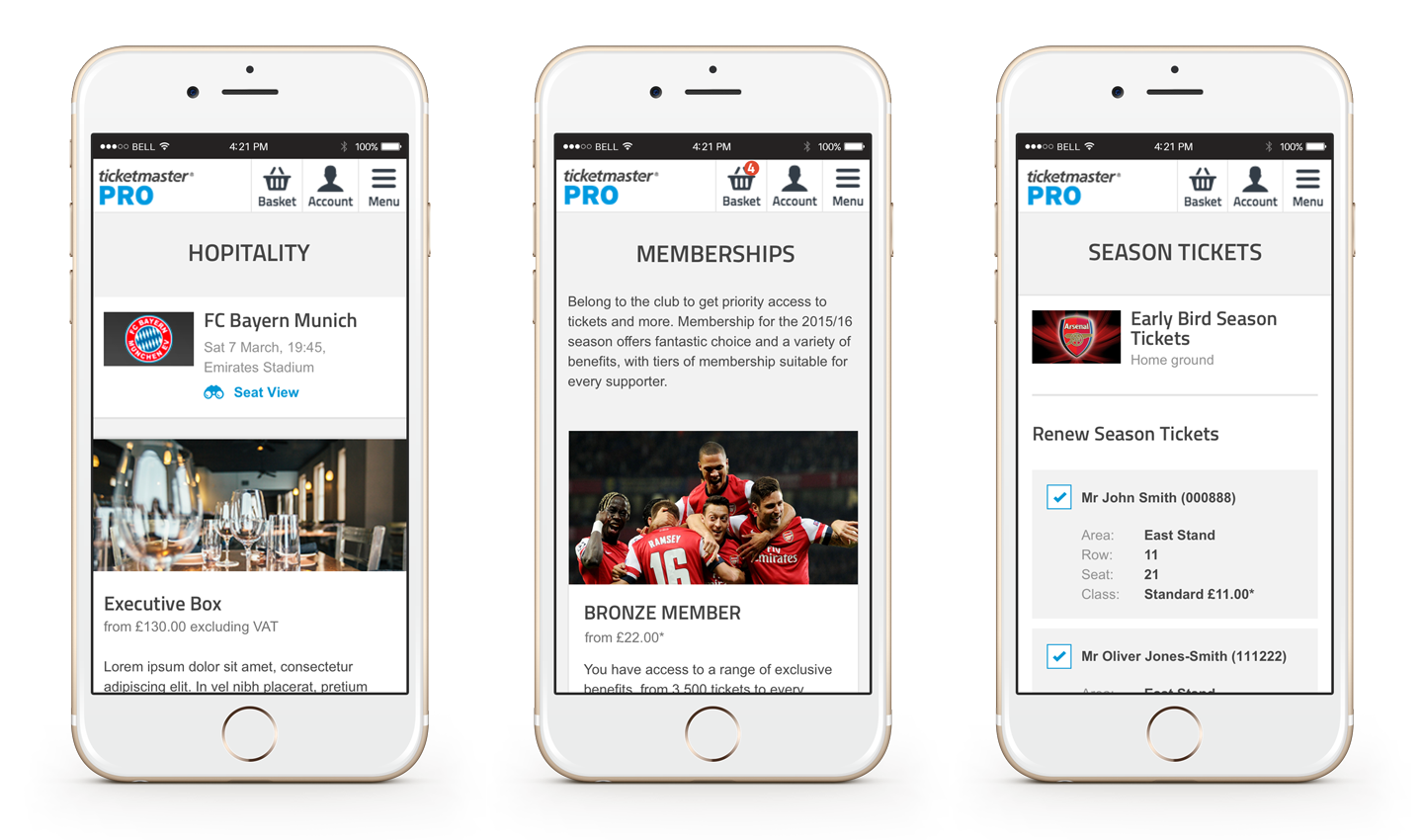
Ticketmaster PRO is a B2B2C ticket booking and membership white label platform used by sports teams such as Arsenal, Manchester United and Tottenham Hotspurs to sell tickets, memberships and other events on their websites.
PROBLEM
The current booking white label site is not fully responsive and lacks the ability to easily add new features. Competitors are offering responsive solutions.
AIMS
- Update the UX to make the site responsive
- Apply a visual style refresh
- Consider how clients rebrand the white label so not to break their current brand guidelines
- Work to aggressive deadlines to deliver designs to the engineering team
MY ROLE
- Gather requirements from stakeholders
- Facilitate workshops with product managers and designers
- UX research and design: wireframe and prototype
- Interview clients and users
- Improve the information architecture
- Usability testing
- Present to stakeholders
- Communicate with an overseas dev team
- Work Agile
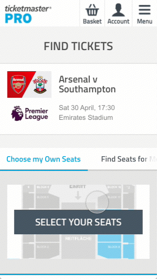
The website before UX refactor
The following screens are of the Arsenal ticket checkout journey and show how the platform is skinned with the client’s branding previous to this UX refractor.

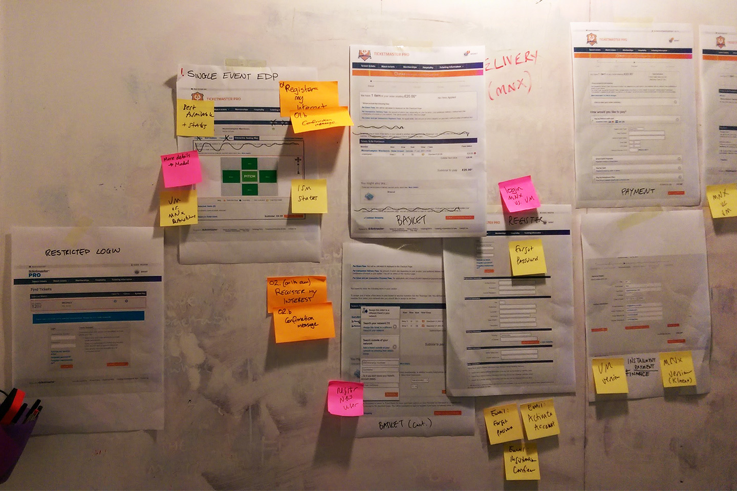
Collaborative workshops to understand the current system
At the start of the project we had a workshop with the product manager, creative director and UI designer to flesh out all the screens and states involved in the checkout journey.
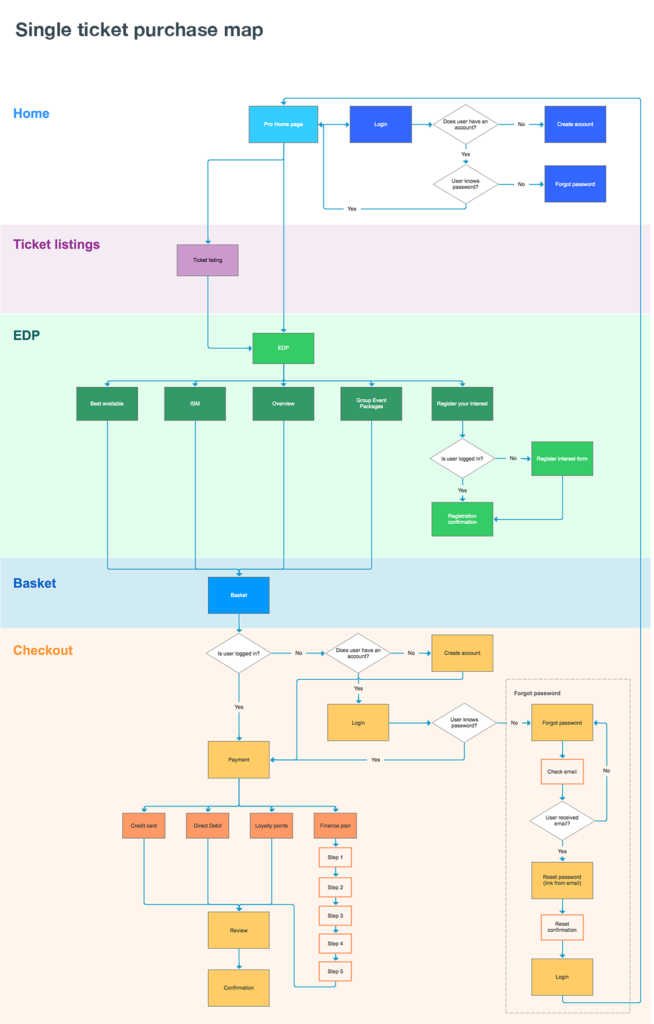
Untangling the current journeys
I mapped out a ticket purchase journey to understand how the pages connected and ensure we had visibilty of all site sections.
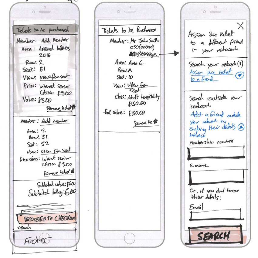
Ideas for discussion
For most site sections I sketched & created low fidelity wireframes for use as a discussion point between myself and the UX manager before moving to high fidelity.
Detailing every interaction & page state
I created detailed wireframes in Sketch to help save time in prototyping and UI as many components could be reused as a starting base for the designers.


Validating terminology
The current tab labels were ambiguous & lacked action; “Best Available” and “Closest to seat”??
We tested those labels with users, with the idea to discover what language they would use to describe those actions. The plan was to use simple terms for the labels and include a verb. After feedback from research findings we went with the terms; “Find seats for me” and “Choose my own seats”. These were then validated with users again and confirmed they had a our desired response.

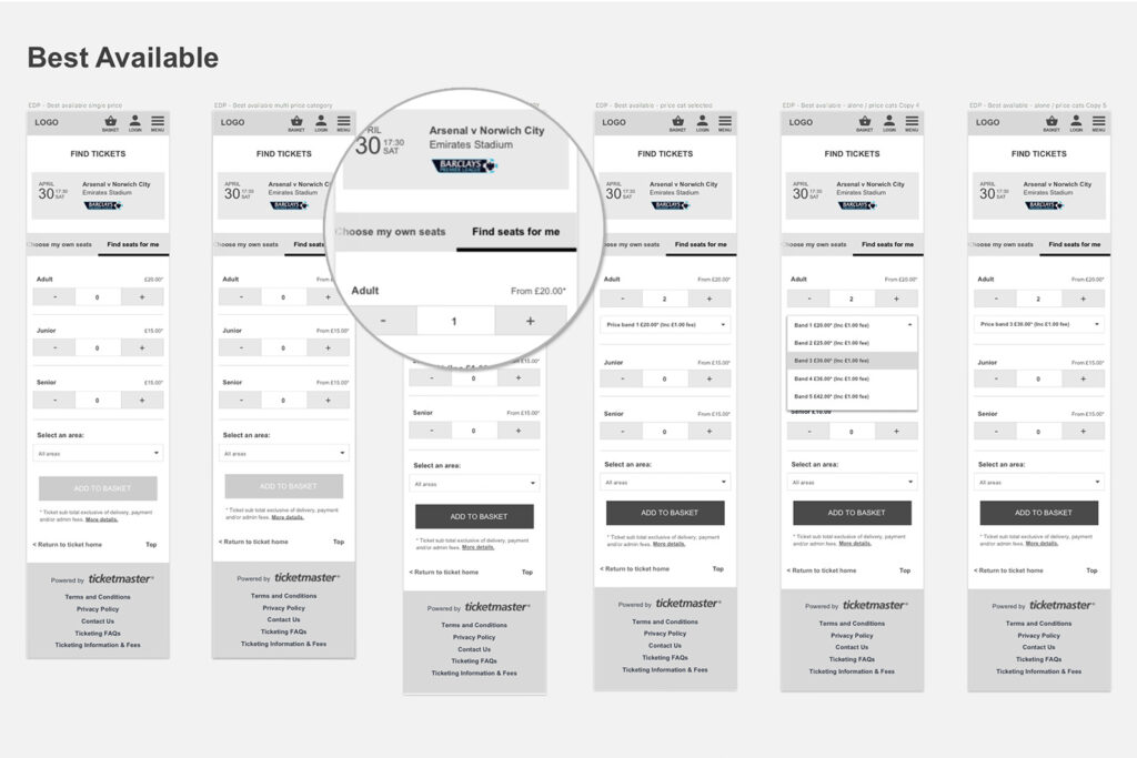
Tab challenges on mobile
The ‘Find tickets’ page could potentially contain four or more navigation tabs, which would impact experience on mobile. If I stacked the tabs on mobile, users would have to scroll past the default-open top tab to see the other tabs available to them:

We fixed this by using a horizontally scrolling navigation bar, which was a common pattern but not without it’s own disadvantages. In our design we ensured that it would always suggest that more tabs were available off-screen by fading the text to the right of the menu.
This decision was then tested with users through remote testing. The results were good, so we went with it.
Tab navigation prototype
I produced animated prototypes to show stakeholders and developers how the new navigation would behave on mobile.
Final UI design
The final UI design used plain branding as it’s a white label UI
that will be skinned to the clients branding.


More case studies

B2B SaaS Shipping app
Access control management