Replacing a legacy Windows app with a new, user-centred web app
Offering clients a better point of sale tool
Overview
TM Flex is a portable, B2B point of sale (POS) web app designed for venue clients to sell tickets seamlessly across various environments such as pop-up and in-venue box offices, or even on foot.
PROBLEM
Ticketmaster’s venue clients are using a legacy Windows app to sell tickets. The app is complicated, non-responsive and difficult to update. Competitors are offering a better app.
AIM
- Design a new, user-centred app, with a touch compatible interface, that allows new users to onboard with little effort.
- Be tablet ready
MY ROLE
- UX design: wireframe and prototype
- Information architecture
- Usability testing
- Document findings
- Present to stakeholders
- Work with overseas dev team
- Work Agile
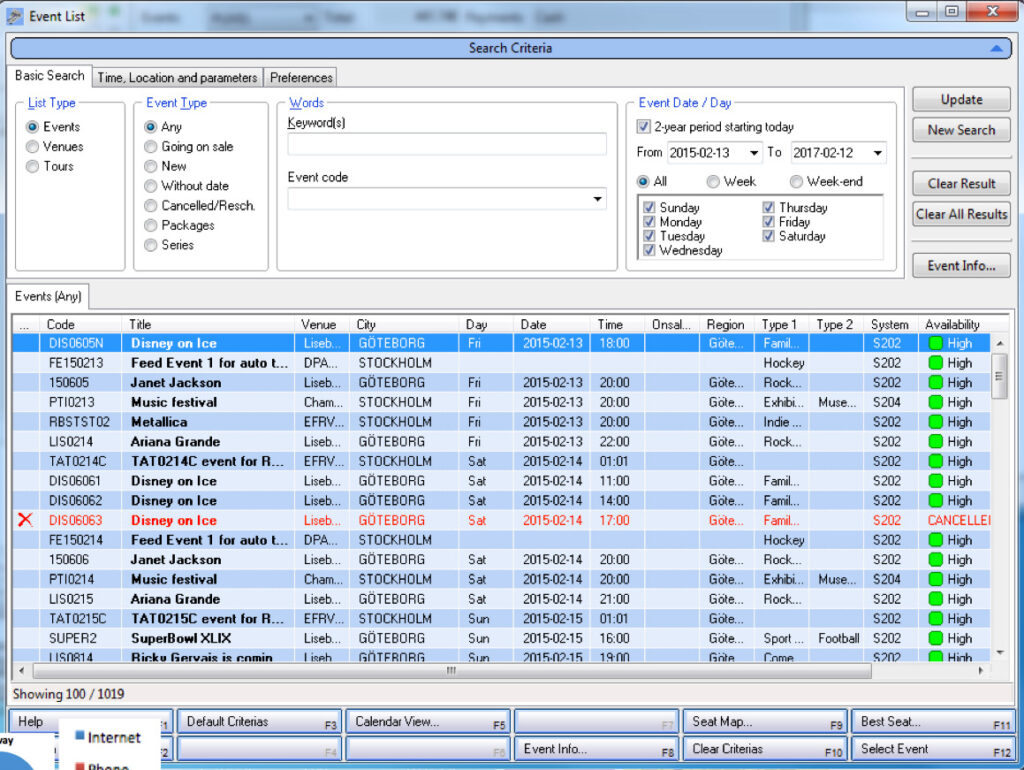
The app we’re replacing
This was the Windows-based application clients were using to sell tickets at box offices and over the phone. Visually very busy and not very nice to use!
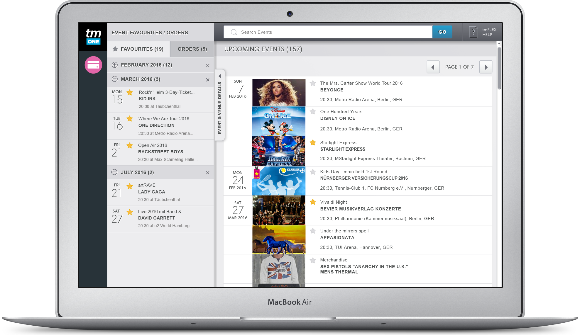
Designing for various types of ticket sellers
The users of the product were venue staff working at their box office. Call centre staff selling tickets over the phone and those selling tickets at outdoor locations such as pop-up box-offices.
As various venues were in close proximity to the office we could easily consult users of the app to validate our design decisions.
Design challenges
The main challenge for the design was creating a UI that suited the three different environments that ticket sellers were based in; box office, call centre and on-foot. To solve this we focused on the key needs & tasks that were common to all the personas. Those were:
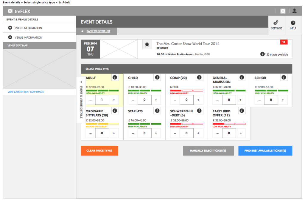
1. Quick access to the most popular or next event.
2. Easily see pricing and availability. 3. Make bookings with or without taking customer details.
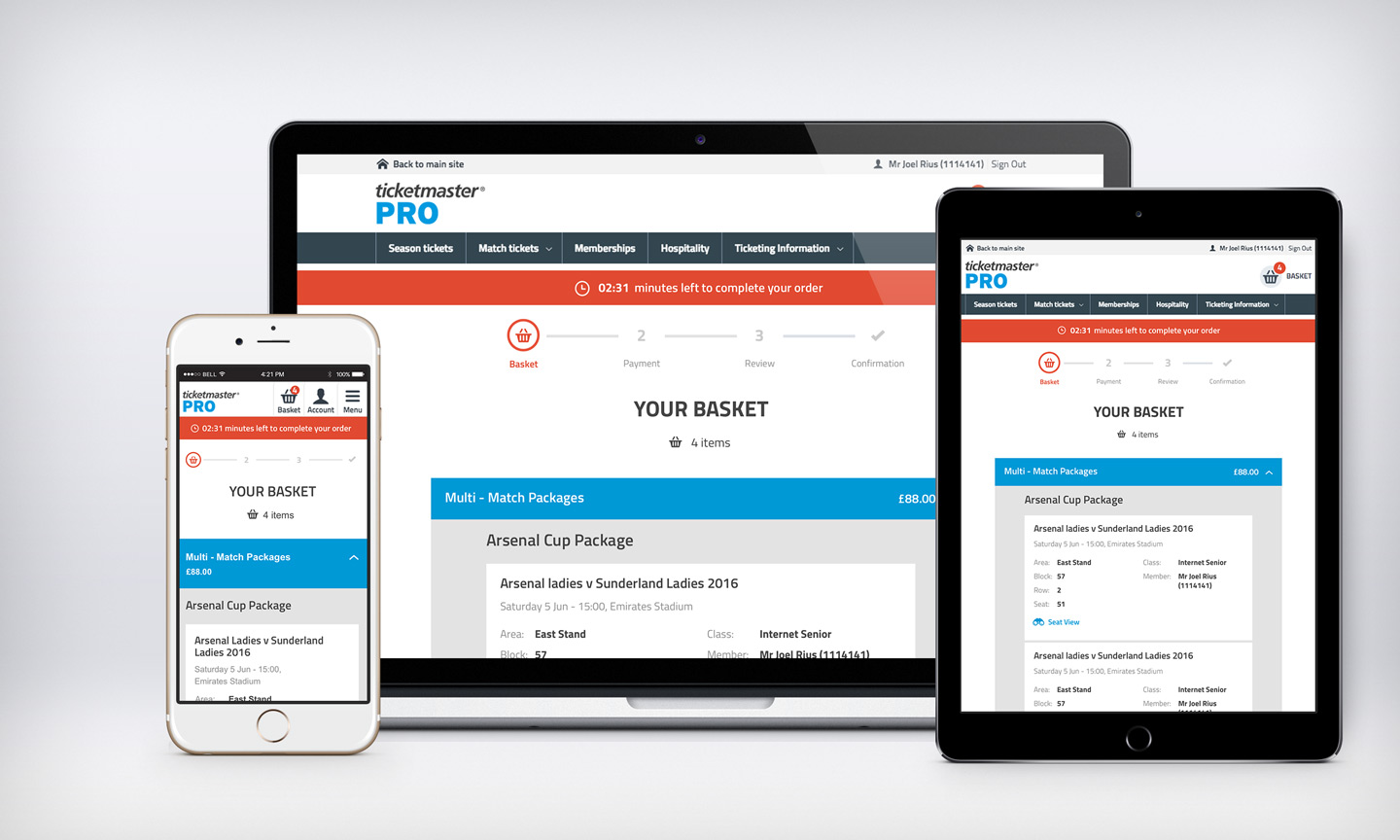
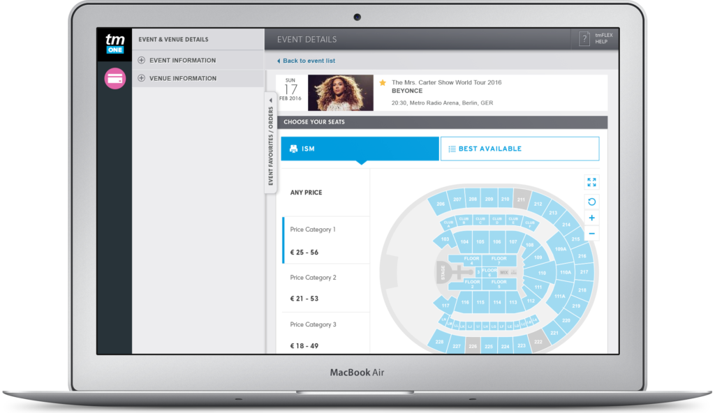
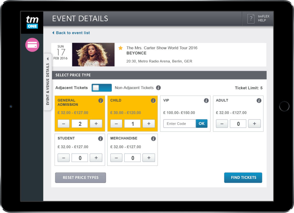
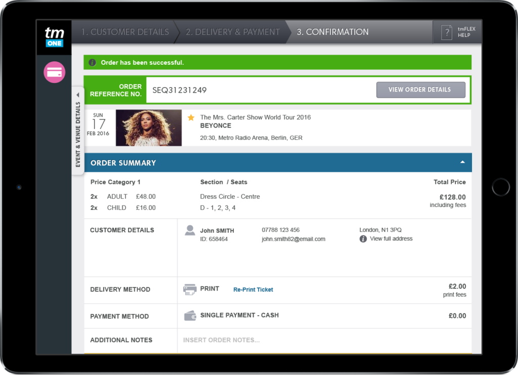
Designing the event booking & checkout pages for desktop & touch devices
Taking the user needs into consideration. The interactive elements on the following screens were designed to accommodate finger taps for a tablet device as well as desktop use. The left side panel, which offers more information about the event, includes an image link to view a larger version of the seating plan.


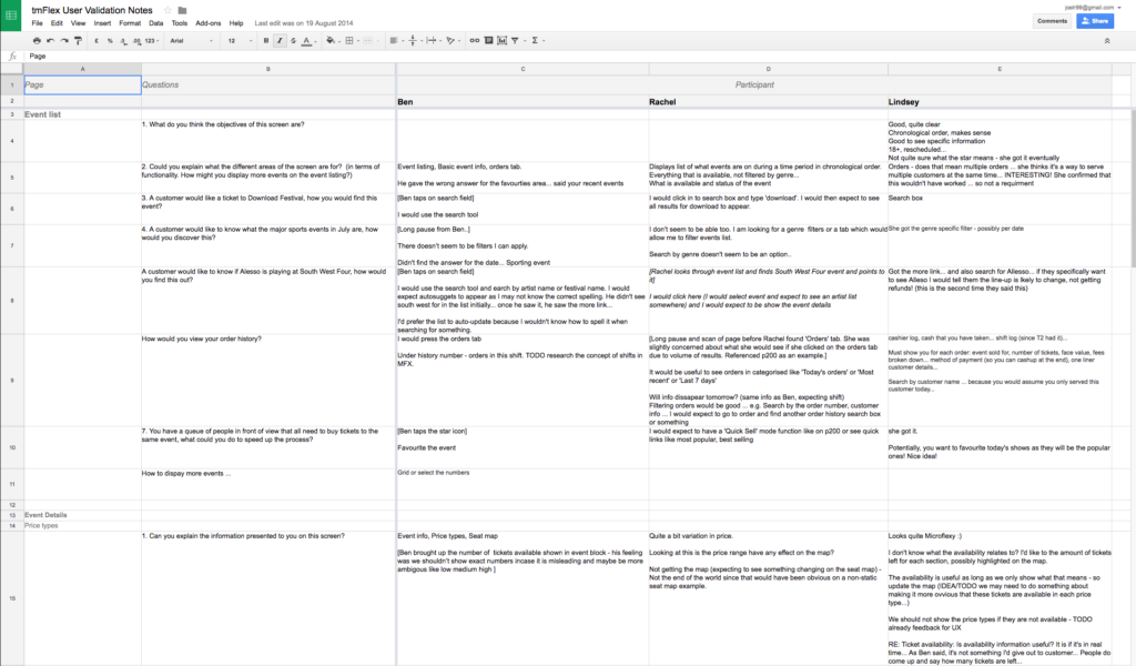
Validating the wireframe screens with box-office staff
We did user testing using paper prototypes with in-house box office staff to validate early designs. I documented the findings on a spreadsheet and produced a deck to present results to stakeholders.
Some of the key user feedback items were:
- Event information should be surfaced early in order to manage customers’ expectations regarding pricing, fees and availability.
- Be able to show customers a seating plan of the venue to point out sections.
- Prefers to use the search bar to find events most of the time.
The insights from testing after every stage allowed me to be iterative in design updates.


Observing the new design being used in a live environment
I visited a venue box office to observe and question staff who were using an early version of the product in a live environment. This gave us an insight into the limitations of their working area and the hardware being used.

Observations
- Due to a small monitor, about 20px of the application was cut off on the right.
- The left toolbar overlapped the application by about 20px, causing the dates in the Favourites list to be partially obscured.
- A horizontal scroll bar was created due to the above.
Documenting findings on Confluence
Research findings were documented on Confluence so they could be referenced for making design updates and posterity.

Final experience based on the Ticketmaster global style guide

More case studies
B2B SaaS Shipping app
Access control management